How did you use media technologies in the construction and research, planning and evaluation stages?
Friday, 24 January 2014

Evaluation Question 3
What have you learned from your audience feedback?
Initially, with our very first rough cut, because our music video was in its very first stages, it was very underdeveloped. The majority of feedback we received from our audience consisted of a mixture of mostly improvements with a few good comments. Many of the comments mentioned that our video fit in well with our chosen genre which is rock/metal, which was our main aim with our first rough cut. We also had positive feedback concerning our sped up shots, saying how they were effective and set the mood of the narrative. One suggestion that was repeated was that some shots were too long, and didn't work well, which we then took on board and fixed for our next rough cut.
Moving onto our second rough cut, we had developed our video substantially further, but it was still unfinished. We had again, a mixture of good and back feedback which we again analysed and took on board. One point that was repeated was that in some shots, the lip syncing didn't match up very well, so we had to re-film some shots to improve and perfect. We also received feedback that some of the lighting wasn't consistent as some shots were darker/lighter than others, so again we had to re-film and adjust. The feedback for our make-up and costume was positive, saying how it fitted in well with our genre and also worked with the band’s image.
Rough Cut 2:
Fixing the issues we had with rough cut 2, we then moved onto feedback from rough cut 3. We had a lot of feedback complaining about some of our shots with our lighting, saying that it was too light in some shots which disturbed the continuity. We were also told to add another location to our video as it needed more colour and variation. Another issue we had was of a shot of some drums, as the floor looked too dark and was inconsistent with the rest of the video.
Rough Cut 3
Considering feedback from rough cut 3, we managed to fix our lighting, ensuring the continuity was the same throughout the whole video. We also fixed some shots as the sound kept overlapping, which was another point we got from our feedback from our previous rough cut. Our audience also stated that the shot of the building we used for our opening was irrelevant and didn't work well, so we also made sure we changed it to fit in better with our video. One of the most consistent comments we received from our feedback was that we didn't include many locations and that we could perhaps add another in, so for our next rough cut we decided to go out on location and shot some outside shots of Connar escaping, which would fit in well with the theme of our music video.
Rough Cut 4
Our final cut received lots of positive feedback, including many good comments on our location saying how it fit in and worked well with our storyline, theme and other shots. Unfortunately, on so e shots sound disturbance keeps appearing and will not go,despite our efforts to fix it, but on the whole, our video got some very good feedback comments that helped greatly improve our music video, as feedback was essential for our video's final completion.
Evaluation Question 1
In what ways does your media product use, develop or challenge forms and conventions of real media products?
The band our group chose to create a music video for was “Kill the Freak” who are a metal band. We decided, as a group, that our music video will also be based on the rock/metal genre to reflects our band's image. When researching into existing music video’s, we made sure to look closely at video’s in the rock/metal genre so that we could see and understand the types on conventions that could relate back to our own video when we created it. Consistent in the video’s we researched, we discovered that the majority incorporated both a narrative and performance of the band/singer into the video. One good example of video that has a good use of performance shots would be “Avenged Sevenfold - Hail To The King” which our video took inspiration from with some of our shots:
Avenge Sevenfold's video: Our video:
Avenge Sevenfold's video: Our video:

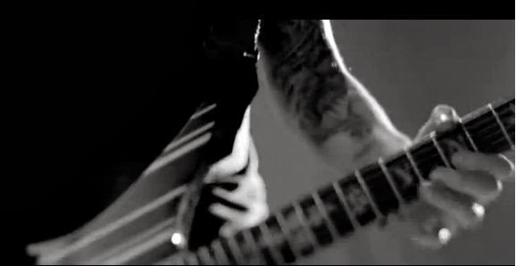

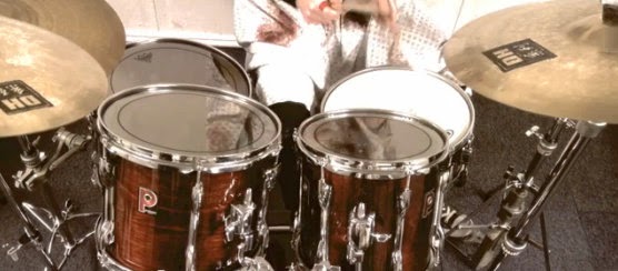
Another convention this specific genre of music video uses is fast paced cuts and editing. In most cases, the music is also fast paced and the storylines used in this genre of video is most commonly tragic or hectic, so the fast paced cuts work well with the contents of the video. A good example of this would be “Slipknot - Duality”:
Also, the majority of rock/metal video’s a shot with dark colours, some even in black and white, again to work with the storylines of the video and to connote that the genre as a whole is quite dark and angry. I think that this aspect of the genre works well with the storyline of our music video so we have chosen to edit our video in a darker light to connote how our storyline is also very dark and twisted. We chose to use a similar colour scheme for our music video to 'Duality' to highlight the dark and gloomy narrative we chose to use:
Slipknot's video: Our video:
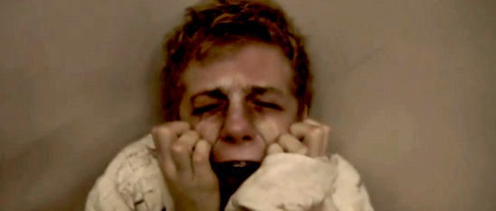
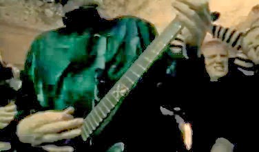
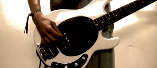
Another video we took inspiration from was Disturbed - Asylum. We chose to consider this video as it fits in perfectly with our mental hospital theme and some of the shots used really sparked our creative imaginations. Since this video is purely narrative with no performance shots, it goes against the conventions of the rock/metal genre, but it has a very similar storyline to our own video which was a good influence. It had some really good close up shots of the mental patients face which I thought worked really well with the theme and gave the video a disturbing vibe to it. There are also alot of fast paced cuts in this video which is a common generic convention, which we chose to include in our own music video as well to reflect real media texts accurately.
Disturbed's video: Our video:
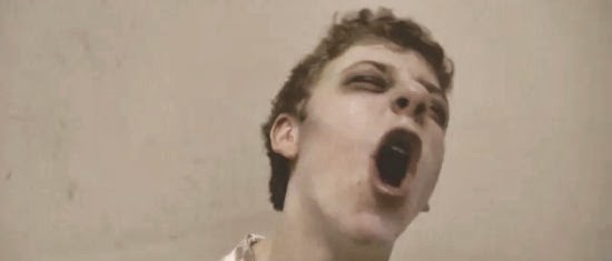
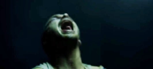
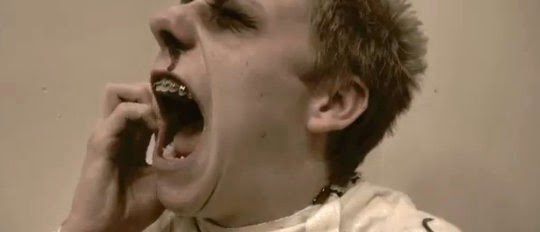
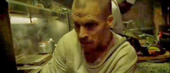
Slipknot's video: Our video:

Another video we took inspiration from was Disturbed - Asylum. We chose to consider this video as it fits in perfectly with our mental hospital theme and some of the shots used really sparked our creative imaginations. Since this video is purely narrative with no performance shots, it goes against the conventions of the rock/metal genre, but it has a very similar storyline to our own video which was a good influence. It had some really good close up shots of the mental patients face which I thought worked really well with the theme and gave the video a disturbing vibe to it. There are also alot of fast paced cuts in this video which is a common generic convention, which we chose to include in our own music video as well to reflect real media texts accurately.
Disturbed's video: Our video:
Friday, 10 January 2014
Saturday, 4 January 2014

Friday, 3 January 2014

Tuesday, 19 November 2013
Intertextuality and Representation in Music Videos
Lily Allen has recently released a video for her song "Hard out Here". She has included a lot of intertextuality relating to pop and rap videos included the one most know for objectifying women "Blurred Lines" by Robin Thicke. Her video has had mixed reviews from the media saying that it is not suitable for younger audiences and it's also racist as it features mostly black and Asian women, however Robin Thicke's song has had mostly bad press but had not been banned from either the TV or online sites such as YouTube.
Lily Allen - Hard Out Here


Lyrics

The content seen in "Hard Out Here" is that of which is most commonly seen in rap videos where the rapper is surrounded by scantily clad women and women dancers. There is also a large amount of references to "Blurred Lines" in how all of the women features apart from Lily and dressed and the way in which they act around the main singer.
Robin Thicke - Blurred Lines


Lyrics

"Blurred Lines" features an excessive amount of footage of women dressed in barely any clothes (or in some shots none) and are also being objectified and shown as "toys" for the men can unwrap and to do what they want with. This video has received a large amount of criticism from the media from newspaper articles to online forums exaggerating this point and trying to get the video taken down.
Saturday, 9 November 2013
Plans for Magazine Advertisment
Here are my plans for Kill the Freak's magazine adverts/posters:


I have made 2 plans for my magazine advertisement, both contrasting in colour and design. I created 2 to show a clear contrast in how I wanted it to look, and to also experimented with different designs to see which one looked best for my groups chosen band and genre.
With my first design, I have included a large picture of a hand with the bands songs tattooed onto it, showing how their songs can mean a lot to someone and are memorable to listen to. I have also included social media sites such as Facebook and Twitter so the fans can contact the band and see what they are up to within their career.
In my second design I have included a fist to connote the pain felt in the lyrics of the bands songs and how their emotions effected their lyric choices. I have also included the bands name and the name of the single so fans can search it on ITunes and purchase it with ease.


I have made 2 plans for my magazine advertisement, both contrasting in colour and design. I created 2 to show a clear contrast in how I wanted it to look, and to also experimented with different designs to see which one looked best for my groups chosen band and genre.
With my first design, I have included a large picture of a hand with the bands songs tattooed onto it, showing how their songs can mean a lot to someone and are memorable to listen to. I have also included social media sites such as Facebook and Twitter so the fans can contact the band and see what they are up to within their career.
In my second design I have included a fist to connote the pain felt in the lyrics of the bands songs and how their emotions effected their lyric choices. I have also included the bands name and the name of the single so fans can search it on ITunes and purchase it with ease.
Friday, 8 November 2013
Magazine Advertisment Analysis 2

The name of the band 'Slipknot' in depicted in the centre of the page in the bands signature front and is a bright white which contrasts from the darker coloured background and picture behind it, as well as the other small print which is also white and stands out clearly. Their logo is also used on every single one of their products and is copyrighted because of branding rights.
The name of the DVD 'Voliminal inside the mind' however is small compared to the name of the band and doesn't stand out as much. The image of the devil makes the DVD look interesting and relates to a horror film so again works well with the bands genre.
This will help when creating my own Magazine advertisement as I can see what colours and fonts match up with the genre I am using, and how images can effect the style I am working with.
Thursday, 7 November 2013
Magazine Advertisement Analysis 1
Justin Bieber -Believe (album) - Teen Now Magazine

On this page of album/single promotions, Justin's album "Believe" has the largest amount of space. The cover used for this album displays a huge close up of Justin's face which covers the majority of the cover, most likely because the record label demands it. The close up of Justin also makes him look important and angelic because of how the light is reflect on certain parts of his face, highlighting features such as his eyes and lips, making him also look more attractive. The colours used on the album cover make the artist look powerful and rather angelic, again because of how the light highlights certain features. The font used is rather simple, but all letters are capitals, making them stand out, especially with the name of the album "BELIEVE" going straight across the bottom of the cover.
The outline of white also stands out well over the darker photo of Justin. Surprisingly the name of the artist uses a very small font compared to the album title, and is displayed at the top of the cover, which is not very noticeable at all. I think the album cover uses quite simple images and texts to not draw your attention to too many aspects, as the main focus is on the artist face. Next to the image of the album is a little summary and description of the album which ends with the sentence "Another Pop classic", making the album sound really good quality and makes the audience want to purchase it.
The outline of white also stands out well over the darker photo of Justin. Surprisingly the name of the artist uses a very small font compared to the album title, and is displayed at the top of the cover, which is not very noticeable at all. I think the album cover uses quite simple images and texts to not draw your attention to too many aspects, as the main focus is on the artist face. Next to the image of the album is a little summary and description of the album which ends with the sentence "Another Pop classic", making the album sound really good quality and makes the audience want to purchase it.
Friday, 18 October 2013
Digipak Plan 2

I've also made another Digipak plan to see if using different colours worked as well, for example using two different blues instead of darker colours such as reds and blacks.
Thursday, 17 October 2013
Digipak Plan 1

This is my second plan for my Digipak design. I have used consistent colours of red, white and black throughout to give an effect of life contrasting death. I have also included the name of the band throughput to both promote them and advertise them.
Monday, 30 September 2013
Lyric Analysis - Idea pitch
Bruce Springsteen

Thursday, 26 September 2013
Digipak Analysis 2
P!nk - The Truth About Love
Outer
Side 1- fold in cover Side 2 - back song listings Side 3 - front cover

Inner
Side 4 - CD slip in Side 5 - Leaflet slip in Side 6 - CD slip in 2

This is P!nk's Digipak for her album "The Truth About Love".
The album's front cover (side 3) on the outside depicts a photo of P!nk (the artist), her name, the name of the album and a promotional sticker. It has been designed this way to promote, firstly the artist as it shows both her name and a large photo of her and also her name and the albums name are in large bold text that is clearly visible on the left hand side.
The back cover (side 2) of the album has a listing of all of P!nk's songs which are on the album and which disc they're on, All the companies that were involved in producing and distributing P!nk's album and the date her album was released.
The fold in cover (side 1) includes a large photo of P!nk covering almost the entire side. I believe this is done to again, promote the artist as she is covering the entire side of the Digipak.
The 4th and 6th sides on the inside, much like Olly Murs' album RPRT, both show half of the album covers name. It is designed well as the font of text, style and colours are continuous throughput the Digipak, making it look neat, professional and work well with the genre of music P!nk produces.
The middle cover of the inside (side 5) also depicts a photo of P!nk, again relating back to Olly Murs' album.
P!nk's Digipak have many similarities to Olly Murs' album even though they are both listed under different genre's of music. I believe that Digipaks hold the same conventions regardless of music genre, but alter in the style they are presented.
Friday, 30 August 2013
Digipak Analysis
Olly Murs - Right Place Right Time


Side 1 - Cover (outer)

Side 2 - Back (outer)

Side 3 - Photo fold in (outer)

Sides 4 + 5 - CD slip in and leaflet slip in (Inner)

Side 6 - 2nd CD slip in (Inner)

This is Olly Murs' Digipak for his album "Right Place Right Time".
The front cover on the outside depicts a photo of Olly (the artist), his name and the name of the album. It has been designed this way to promote, firstly the artist as it shows both his name and a photo of him in the centre of the cover And also the album name as it's repeated in different styles in the background behind Olly.
The second side which is the back cover of the album has a listing of all of Olly's songs which are on the album and which disc they're on, All the companies that were involved in producing and distributing Olly's album and the date the album was released.
The third side which is the fold in photo is a big photo of Olly that covers the whole side. I believe this is done to again, promote the artist as he is covering the entire side of the Digipak, but for a fan, it's also nice to look at as he is an idol.
The fourth and sixth sides on the inside both show half of the album covers name and all of the songs of the album in the background of each side. It is designed well as the font of text, style and colours are continuous throughput the Digipak, making it look neat and professional.
The fifth side which is the middle cover of the inside also depicts a photo of Olly looking handsome and idolistic, showing that the photo is most likely done by a professional photographer.
I have analysed this Digipak to gain insight into what each side/cover should include, colour/font themes and what different genre's have in common/contrast.
The fifth side which is the middle cover of the inside also depicts a photo of Olly looking handsome and idolistic, showing that the photo is most likely done by a professional photographer.
I have analysed this Digipak to gain insight into what each side/cover should include, colour/font themes and what different genre's have in common/contrast.
Friday, 16 August 2013
Textual Analysis of Music Video's 3
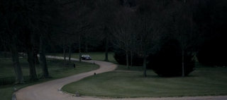 At the start of the video, both diegetic and non-diegetic sounds can be heard of the setting and background of the destination the video is set in such as the wind,a crow and a car driving along and pulling up, connoting that the atmosphere is eerie and unpleasant. The song then starts at around 28 seconds into the video.
 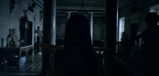 There are no titles present throughput the video. At 2.39 the music then stops and the sound of diegetic footsteps of a lady walking can be heard which have been emphasized connoting that the atmosphere is tense and the footsteps are very loud and nerve wracking.
 Just before the music starts again at 3.06 a water droplet falls making the sound of a gunshot. This ties in with the chorus lyrics - "Now she's gone, and I'm picking up the pieces", connoting the male characters lover has died and Paloma who is depicted as the girlfriend has to deal with his heartbreak even though she cannot truly replace his past lover.
 Also at the start of the video, the setting is shown straight away - an old mansion, connoting that the main male character is wealthy but rather old fashioned. Throughout the video more shots of the mansion are shown including the garden where Paloma is performing which connotes that she feels left out and abandoned because of her failing relationship.
 When Paloma is singing on her own outside, long shots are used to show her full body and the background with a single bench and the mansion. This connotes that she has been forced outside on her own, much like how in her relationship she feels alone and left out.
 Also, lots of close ups of Paloma's face are shown to emphasize her emotionless expressions, but also because the record label demands it to promote the artist.
Thursday, 15 August 2013
Importance of Digipaks and Magazine adverts
Digipaks and Magazine adverts
Digipaks are a CD case in a folded book-style paperboard, with one or more plastic trays capable of holding a CD attached to the inside. They usually consist of 6 - 8 sides, each with a different picture, CD or leaflet attatched. The digipak design often relates to the Genre of the artist/band and usually consist of generic conventions of the chosen genre. There are also close similarities and relations between the digipak and the target audience.

Magazine advertusements for music video's/artists tend to include the single, album or tour, the release dates and an image or generic convention of the band/artsit. Most advertisements tend to be about a page of a magazine so there is enough room to fit all the information and images that need to be advertised.

Both digipaks and magazine advertizements are important because they are good for promoting the band/artist as images and important information is usually displayed ensuring the target audience are interested in what's being advertised. Particulary with Digipaks, the target audience can usually tell what the genre of the artist is based on the design and genric conventions icluded in the design.
Sunday, 11 August 2013
Textual Analysis of Music Video's 2
Need U 100% - Duke Dumont
 At the start of the video, the name of the song and the artist is displayed on the screen. I believe this is effective as it makes the video look professional and of a high standard.
 Also, at the start and end of the video, diegetic noises from the hospital can be heard over the music, connoting that the main character is going to have an operation meaning the video should be serious, but as the story progresses we can see that the dancing juxtaposes this theme.
 This video has a narrative throughout . At the start of the video, again we can see the main character in a hospital meaning he needs some sort of operation and as the story progresses we can see the reason why - he has a radio inside him in which people around him start frantically dancing to.
Subscribe to:
Posts (Atom)